FireThaiger
Three Months to Create a
Successful Ghost Kitchen
Again...
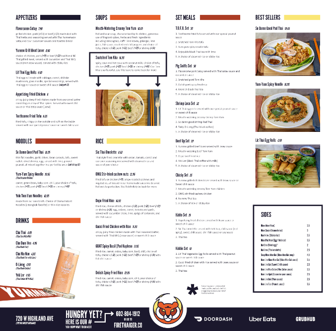
FireThaiger was a three month proof of concept to test initial interest in a Japanese curry house in the Phoenix Metro area. Within three months of opening the concept, the restaurant was breaking even. This project had an extremely fast turnaround and included everything from naming, logo design, web design, social media, menu design and food photography. Just like with Chōchin Curry House, the beginning of the project started with picking a name. We wanted something that didn't take itself too seriously and gave the obvious suggestion that this is a Thai kitchen; this meant that most, if not all traditional Thai names were excluded. After playing around with many names, we landed on the name, FireThaiger.

We cycled through a few bad ideas...

But then we decided it was best to enforce the "circle rule" through the entire logo and everything clicked together.
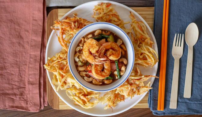
With a solid logo and a good idea for the rest of the branding, it was time to turn our attention to the food photography. We used a lot of the same dishware from Chōchin Curry House, but one of the smaller changes that we thought added the "sprinkle" on top was using orange chopsticks to go with the overall color scheme of the brand. This really helped cement the idea that FireThaiger was its own entity.


After the food photography came the menu design and really fleshing out the identity of FireThaiger. Sticking to the established colors shown in the logo was important to keep everything consistent. During the menu design phase, adding an additional layer of "identity" came in the form of funky menu item names. This became a fun way for customers to interact with something that is often viewed as a boring piece of laminated paper.