Chōchin Curry House
Three Months to Create a
Successful Ghost Kitchen
Chōchin Curry House was a three month proof of concept to test initial interest in a Japanese curry house in the Phoenix Metro area. Within three months of opening the concept, the restaurant was already turning noticeable profits. This project had an extremely fast turnaround and included everything from naming, logo design, web design, social media, menu design and food photography.
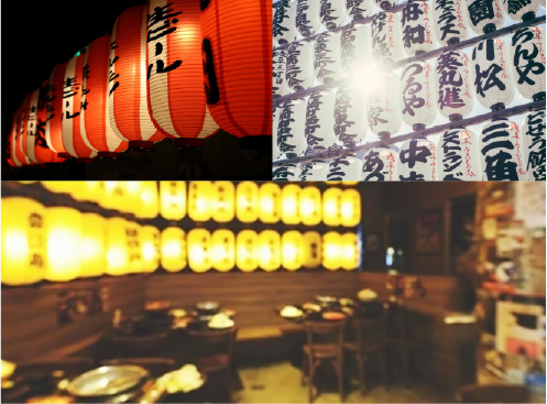
The beginning of the project started with picking a name. We wanted something that was culturally significant to Japan but still relatable to a western audience. Red lanterns is something that frequently comes to mind when thinking about Asian cultures, so we knew right away what to do. Chōchin is the Japanese word for "lantern." Lanterns exude a warm cozy feeling, which is exactly the mood a curry house should communicate. So the name, Chōchin Curry House was born.
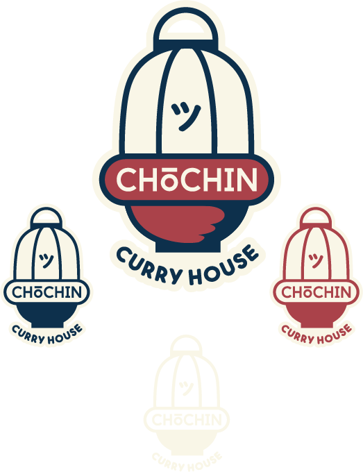
The first logo design was an attempt to go after something that looked homemade or made by hand. Traditional chochin are made by hand, so following a "handmade" theme seemed to make sense at first. We didn't want to just depict a chochin, there needed to be an element that suggested that this is a restaurant, not a chochin shop. To solve this, we decided to place the chochin in or on a bowl or sake cup. We really jived with this idea, but the "handmade/hand drawn" style of the logo just wasn't cutting it. A lot of the time, Japanese design is very clean and simplistic. There were a few other iterations, but it just didn't seem to fit and in the end abandoned the "handmade" aspect of the logo.
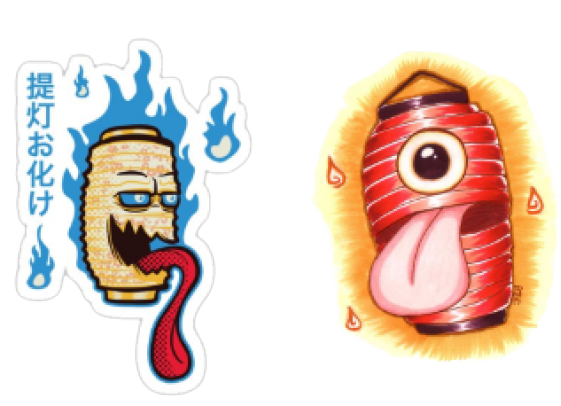
While keeping the original concept of a lantern in a bowl in mind, we cleaned up the design and eventually landed on a solid logo. Things quickly fell into place and were able to add some extra depth to the original concept. Traditionally, there is supposed to be big bold lettering in a vertical orientation on the lantern; we even tried playing with the name of the restaurant in this fashion, but it order to keep legibility a priority, we opted to keep the name horizontal. Instead, we decided to lean into a few ideas and then blend them together. In the end, we ended up using the Japanese character "ツ," the Japanese emoji for a smiley face. Using the emoji also leans into the heavy yokai, or Japanese ghost culture... There may or may not be a yokai in the Chōchin Curry House lantern.
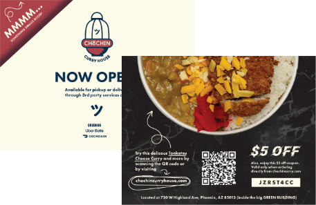
With only a week left before launching Chōchin Curry House, we decided to focus our efforts on food photography and menu design, so that if other parts of the project fell behind, we could still hit the ground running.
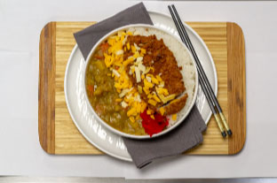
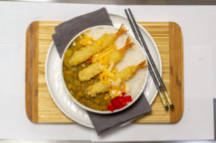
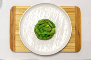
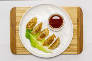
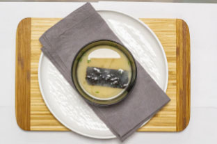
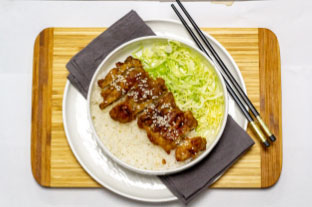
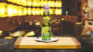
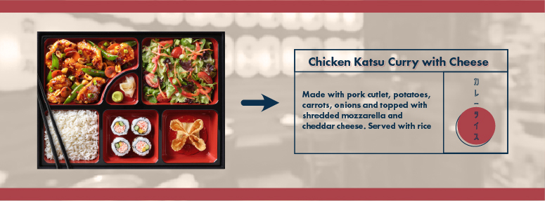
Since this concept was working out of a ghost kitchen, we didn't have a restaurant that we could use to help sell the branding and experience of eating at Chōchin Curry House. This is an important aspect of eating out, whether it's dining in or take-out. To sell the Chōchin Curry House experience, we just used a bit of Photoshop magic.
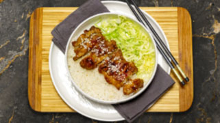
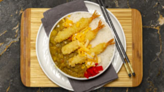
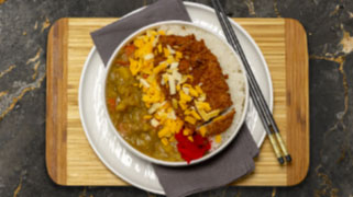
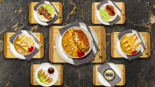
For the website and menu, we drew heavy inspiration from the Japanese's need for organization and compartmentalization, reflected in a lot of every-day items like the bento box.
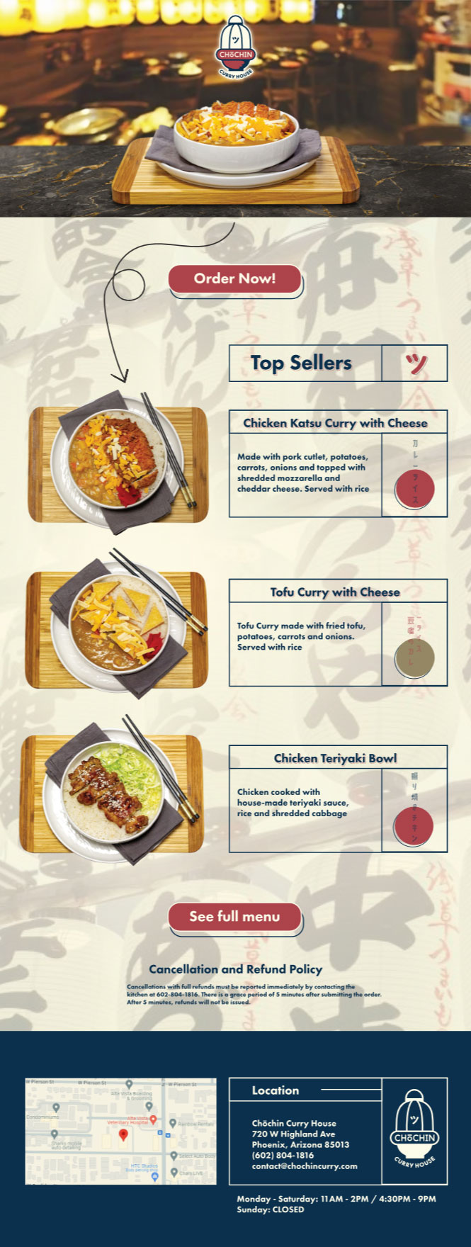
With the menu and photos live on the Square site, DoorDash, Grubhub and UberEats, the ghost kitchen had officially launched, but there was still some work left to do. This would've been a considered a "soft launch," which is usually frowned upon in the food and beverage universe, but this was just a proof of concept and it made things easier when measuring success. After a short marketing campaign, profit margins were pushed up to 6%, which is a fantastic number to reach. Marketing efforts included a social media campaign, mailers and making sure that the website had solid SEO. After experiencing a successful three months of business, Chōchin Curry House will open a brick and mortar location in the Phoenix Metro area in the near future! Soon I'll be updating this page to reflect the expanded design process.